Help
This is the Help page for the
Firstly, choose a dataset from the Dataset Menu (top pane).
Then click on a link in the Menu (left-hand pane) to perform tasks.
This documentation consists
of Basic Help and an Example. The web site is designed to be fairly
self-explanatory.
|
Important Note The browser Back button is very
useful when using forms. For instance, you might create a plot and decide that
an option should be changed. If you click on the Plot
Data
menu item, the form settings will be reset to their default values – this can
also be achieved by clicking on Reset to Default Values. If you click
the Back button, your previous settings will still be active. |
Browser Issues
The presence of
multiple toolbars or window tabs in a browser desktop may affect the screen
(frames) layout. The effect seems to be more noticeable with Microsoft Internet
Explorer than Mozilla Firefox.
In either case, consider closing some toolbars or tabs or switch to the browser
full screen mode. Only Internet Explorer 6 and Firefox
(various versions including the latest for PC) have been tested.
In order to force
the automatic refresh of plots certain HTML META tags have been added to some
web pages. These seem to do the job for most of the time but it appears that a
browser can interfere with this process. If in doubt, use Refresh (Internet
Explorer) or Reload (Firefox).
Known Bugs
The only known bugs
at present occur in Plot Data:
1.
If the data is noisy i.e. there are many polygons to shade,
there may be colour flooding i.e. the colour
for a contour band may overwrite an adjacent band. The occurrence of this
problem is lessened if you choose a larger
contour interval or plot a smaller
region e.g. a polar map from 30-90°S.
2.
When using the Region option if the map
width (in degrees) is less than or equal
to the map height (in degrees) the plot header appears over the image. For equal dimensions e.g. 100-160° E, 0-60° S, use
(say) 100-160.01 instead. Otherwise, simply turn off the header i.e. uncheck
the Header label box. For a narrow plot you will probably want to omit the
header anyway.
Basic Help
Firstly, choose a dataset from the Dataset Menu (top pane) e.g. ERA40. You will then see
the dataset name appear under Current Dataset in the Menu (left-hand pane). Then click on a
link in the Menu to perform a task.
The intended way of
using this web site is:
1.
Select Data. You may choose a cyclone variable e.g. system
density (SD), a season e.g. JJA, and a range of
years
e.g. 1960, 1972, 1981, or all available years.
2.
Optionally, Create Reference Data and then Create
Difference Data. Note that in terms of average maps: Difference
= Selected – Reference. In the case of Reference Data you may pick whatever season
and range of years that you wish but you are restricted to the same variable as
the current Selected Data.
3.
Plot Data – any of Selected, Reference and
Difference Data. The default is a global colour plot
but you may change the projection (including region) and contour properties.
4.
View Images - any of Selected, Reference and
Difference Data. You may view the Current image (most
recently created) or a Composite of Selected, Reference and Difference Data.
The All option allows you to view normal and large PNG as well as
Postscript images. You may also save an image form this menu
option.
5.
Save Data - any of Selected, Reference and
Difference Data, including the average map (grid or field) and the set of
maps
used to form the Selected or Reference average maps. Note that in terms of
average maps: Difference = Selected – Reference. There is no set of Difference
maps since there are typically different numbers of years for the Selected and
Reference cases. You may save in conmap (CIF | CMP) format or NetCDF format. The latter
should open in most common packages including the freely available GrADS
software.
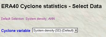
Select Data
Firstly, choose a dataset from the Dataset Menu (top pane) e.g. ERA40. You will then see
the dataset name appear under Current Dataset in the Menu (left-hand pane). Then click on a
link in the Menu to perform a task.
From the Menu (left-hand pane):
Select
Data
You will be
presented with a web form. You may select a seasonal average of cyclone
statistics for one of the cyclone variables:
·
System density (SD) [systems per (1000 deg. lat.)2]
·
Laplacian of pressure (CC) [hPa/(deg. lat.)2]
·
Depth (DP) (hPa)
·
Central pressure (PC) (hPa)
·
Radius (R0) (deg. lat.)
where 1 degree of
latitude (deg. lat.) is approximately 111 km.
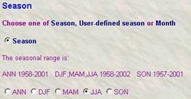
The default
selection is: system density and annual maps (grids or fields).
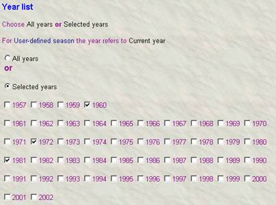
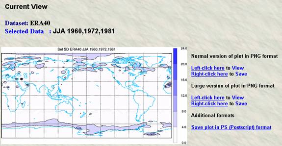
For example, for
JJA:
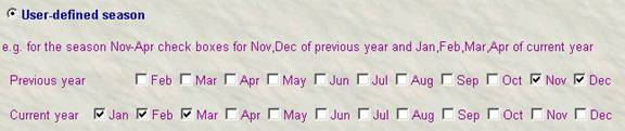
For User-defined
season you may choose months in a previous year. The example below shows
November-March. Note: Make sure then you select the appropriate season button – ticking the boxes below does not turn on the User-defined
season
button.
You may select
either all available years or any subset by ticking the required boxes. In the
latter case make sure that you choose the Selected years button.
When
you have finished making your selections, click on the Submit button. You will be
notified of any errors. Otherwise after
about 10-30 seconds, depending on the number of years to be processed, you will
see the message:
Working ...
Done
You nay now proceed
to the Plot Data and Save Data menu items. Optionally, you may wish to Create
Reference Data and then Create Difference Data.
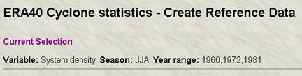
Create
Reference Data (optional)
This is identical
to Select Data except you cannot choose the cyclone variable (it is the
same as the Selected Data). The choice of variable, season and year range is
annotated at the top of the Reference Data form.
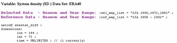
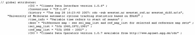
Create
Difference Data (optional)
After selecting
this option the Difference Data will be created. Note that in terms of average
maps: Difference = Selected – Reference. There is no set of Difference maps
since there are typically different numbers of years for the Selected and
Reference cases. The screen will show the NetCDF header for the Difference
Data. The global attributes sel_map_list and ref_map_list give the season-year information for the
Selected and Reference Data sets used to form the Difference Data. In this
example, the Reference Data comprises all available years for JJA i.e.
1958-2002 in the case of ERA-40.
…
Plot Data
From the Menu (left-hand pane):
Plot
Data
In the section Data type choose from Selected, Reference or Difference Data
( = Selected - Reference).
Click on the Submit button for the default plot settings (a global colour map). The image will appear in the right-hand pane and will also be available under View Images from the Menu.
Alternatively, customise the
plot by adjusting the remaining settings on this page.
The
important aspects are:
·
Type of map
·
Select the Hemisphere or Region
·
Contour parameters: you may leave these set
to Auto if you wish
·
Palette: Jet is the default; Grey is for greyscale plots
The
other parameters are fairly self-explanatory. Regarding colour
plots, you may also select a colour bar (under Colour
options) with either a vertical or horizontal orientation. A
vertical bar is the safest option. For plots selected by Region a
horizontal bar may be more appropriate especially if the plot has a small
latitudinal extent. For all plots the bar should appear in a suitable place if
either of the options Automatic
position or Automatic
with user endpoints is selected. The latter allows the Y
extent to be adjusted for a vertical bar and the X extent for a horizontal bar.
For plots selected by Manual there
are additional controls on the placement of the colour
bar, since the physical position of the plot changes. X varies from 0.0 to 0.9
and Y from 0 to 1. Hence, for label bar purposes, the horizontal bar is centred at 0.45 and the vertical bar at 0.50. Furthermore,
the label format is a Fortran format e.g. F6.1. This
is used to create nice values on the colour bar (it
has no effect on the contours). You may use F,I E or G formats for floating
point, integer, exponential or general numeric values. The general form is w.d where w is the width in digits of the value and d is
the number of decimal places. For MSLP and a contour interval of 1 or greater
you can use F6.1 or I4. Finally, you can enter your own plot header under Map
parameters.
For
plots of system density it may be preferable to choose a palette like Grey,
Cool or White-Red, White-Green or White-Blue. By default, the White-Blue
palette is selected. To use other palettes clear the relevant box in the Palette
section. For anomaly plots the default palette is Blue-Red (Anomaly). Check the
box in the Palette section to allow other palettes for
anomalies.
After
you click Submit, there will be a delay of about 10-20
seconds (sometimes longer) before the plot is displayed. You may click on the
indicated link for a larger plot (controlled by the PNG plot density parameter
under Plot size). The plots (images) may be saved as
indicated on the page – they are PNG images, apart from the Postscript file.
View Images
From the Menu (left-hand pane):
View
Images
·
Current
·
Composite
·
All
Current –
This displays the current image i.e. the most recently created. It includes a
description.
This
page also allows you to view your current image as normal or large PNG and
Postscript.
Composite
– This displays the three images for the Selected, Reference
and Difference Data, provided that each has been created via Plot
Data.
All –
This is a handy way of getting to any
of the created images for viewing or saving.
Save Data
From the Menu (left-hand pane):
Save
Data
conmap (CMP | CIF) or NetCDF format
This
page allows you to save any of the created maps (fields or grids). You may save
the average (or single) map as well as the set of maps used to form the average
map. There is a choice of our internal format (conmap) (CMP | CIF)
or NetCDF. NetCDF files may be opened with other
software like GrADS or Matlab while the latter is
mainly intended for internal use. In addition,
you may view the NetCDF header of the average map or set of maps.
Example
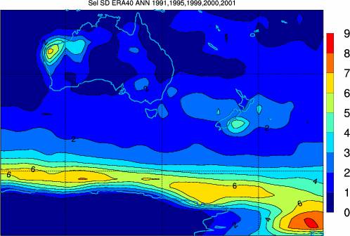
1.
From the Dataset Menu (top pane) click
on ERA40.
2.
From the Menu (left-hand
pane) click on Select Data. By default, you have chosen system
density (SD) and the annual case (ANN under Season). Select the years
1991, 1995, 1999, 2000 and 2001 from the Year list. Make sure that
you also click the Selected
Years button. Note that there is no 2002 file for the annual case for this
dataset. Click Submit.
3.
From the Plot Data menu item click on Submit. By default, you
have chosen Selected Data under Data type and a global colour map. After about 10-20 seconds you will see a global
plot with colour bands.
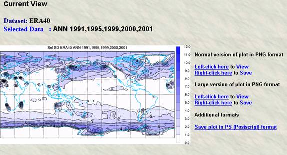
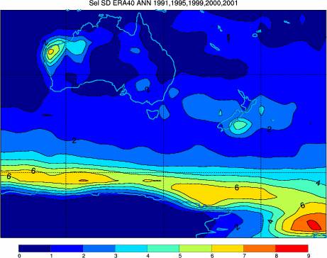
4.
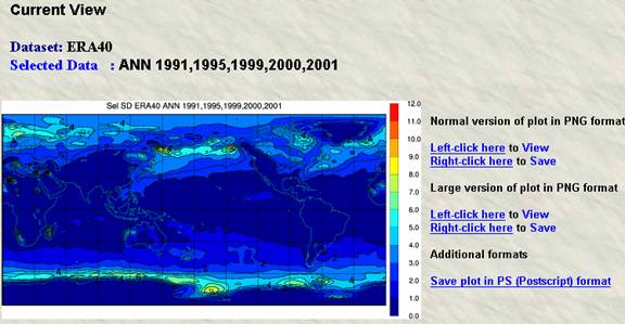
To use another palette check the box Allow
palettes other than White-Blue for System Density plots. Click the
browser Back button. You can try a rainbow colour
(Jet) plot – select Jet from the Palette pull-down menu.
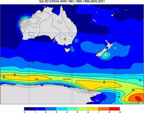
5.
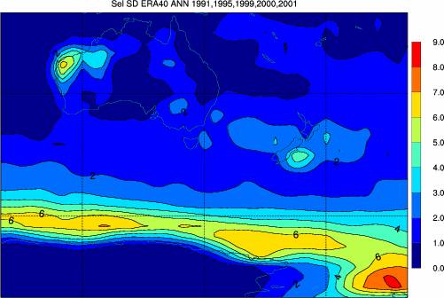
Click the Back button. Select Region. For Lat. range,
enter -80 -10. For Lon. range, enter 100, 200. Click Submit. (The image below is shown
without the screen snapshot).
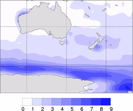
6.
Since these labels may be represented as integers, click Back and enter I2 in
the Bar label format box. Also, under Map parameters, change Continental
line thickness to 5. Click Submit.
7.
The bar labels are larger since the colour
bar is automatically scaled to the plot. To place the bar horizontally select Horizontal under Colour
options
and click Submit.
From this point on it will be assumed that the user will click Back and make the desired changes in the Plot
Data
page.
8.
We can compress the extent of the horizontal bar by
selecting Automatic with user endpoints and changing the X
position values to 0.15,0.75 (centred
at 0.45). We will also shade the continents in grey by selecting Shade
continents (if we use masking there are no contours over the land
areas). Change the Continental thickness
back to 1.
9.
To make the colour bar larger we can select the Manual option. Note: This
is only sensible with plots by Region due to the larger ‘whitespace’ available.
Change the Y position for the horizontal bar to 0.05,0.15.
These values are obtained by trial and error –start with 0.00,0.10
and increment. For variety we will make some other changes. Select Bands
only, Mask – Continents , Continental line thickness to
5 and their Colour to Black. Turn off the plot header by unchecking the Header label
box. Finally select Palette – White-Blue.
10.
We can plot the anomaly of our average (or single) map from
the long-term climatology. Of course you can define your own reference dataset
based on (say) El Nino years. For this example we shall define our reference
dataset to be a climatology of all available years. In
order to do this we must first Create Reference Data from the Menu, followed by Create
Difference Data. After choosing Create Reference Data select the All years button. By default, the Season will be annual
(ANN). Click Submit. Then select Create Difference Data from the Menu. The
NetCDF header dump of the Difference Data set will
confirm the choice of Selected and Reference Data.

11.
You may now select Plot Data or Save
Data
for any of the three datasets: Selected, Reference and Difference Data. You may
also use View Images to look at these images as a Composite or to save them
in PNG or Postscript format. From the Save Data menu item you can
save the data in conmap (CMP | CIF) or NetCDF (you may view the NetCDF
header too).
12.
You can make an image of the Difference Data with Plot Data.
Choose Difference Data under Data type. Use Automatic position under Colour options. Change the Bar label format to F6.2 and set Mask to None.
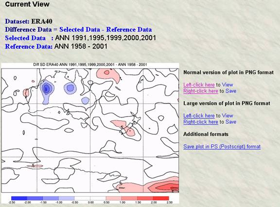
13.
We can change the contour interval to 0.2 by setting the
third box under Contour parameters to 0.2 i.e. Auto, Auto, 0.2. Also change the Bar
label format to F5.1, the X position to 0.05,0.85 and Automatic
with user endpoints. You can also turn off the contour lines and just have colour bands by selecting Bands only under Type of
map.
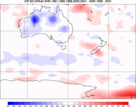
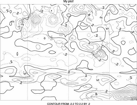
14.
As a final example you can display the plot as a contour
plot by selecting Contours only under Type of map. Note: Although
the colour bar options have been selected they are
overridden. Also, enter your own title in the Plot header box e.g. My plot!